hey gifted kids! it's amanda here. i know some of you are scrolling back through old genius blogs in order to find inspiration for your project. i just wanted to let you know that you're probably doing incredibly, and the skills you're learning here will probably help you in the future, whether you know it or not. i haven't picked up a pastel in over a year, but the things i learned about blending and color theory help me in my daily life. or, of you hate this project, you only have a few weeks left and then its over. good luck! ❤ ❤ ❤ ❤ ❤ ❤ ❤ ❤ ❤
![]() |
| Actual photo of me emerging from the void of anxiety |
It’s over! At last! My week of Suffering-I mean practicing-is
finally over! And the project? Also over!
Prepping for my presentation was a ride. As I mentioned
above, I was practicing for a week. I was so nervous that I would freeze up on
stage, I practically memorized my script back to front. And when I realized
that it might be difficult to maneuver through so many notecards (about a
dozen. Don’t judge!), I spent the entire afternoon beforehand weaning myself
off of nine of the notecards, until I had only three to assist with my
conclusion. Three sounds like a lot, but, with my ridiculous giant handwriting
it really wasn’t.
I went just after Ellie, so I was already worried that my 8
slide presentation was too sparse, and not lengthy enough.
| haha oops |
The real anxiety hit in the ten minutes before I
presented. I was turning the slides in Ellie’s presentation for her, and at
some points my hand was shaking so much I feared I would have hit the space bar
without realizing it. I didn’t, luckily, but it was a close call.
I don’t remember much about the presentation itself. It was
just like another rehearsal, just in front of more people. It didn’t feel as
awkward as when I had practiced for one or two people, since I was so far away
and was really just addressing the back wall. I don’t recall freezing up or
forgetting anything, though my conclusion was a bit shorter than I had
rehearsed just because I wanted to get it over with.
The minute I took the stairs off the stage (yeah, peter, I
took the stairs. Like a civilized human being.) I was so relieved. I knew I had
done well, and now all I had to do was watch the presentations of others.
Overall, I’m really happy about how this project has turned
out. It’s really inspired me to put down the computer more often and pick up a
pencil (or a pastel, for that matter). My spring break plans definitely will
include using the pastels that I’ve forgotten to give back to Nina (sorry man.
I’ll give them back soon.) to make some more pieces just for fun, without the
pressure of grades or showing them to others. I also hope to regain some of my
old hobbies, like drawing people, or crocheting.
Maybe I’ll post on here again. But, if not, I’ve done
pastels, and this Amanda signing off.
![]() |
| You thought you'd seen the last of me? Surprise. I did have a final project, did I not? Here she is! |
I'm presenting Tuesday, and its Sunday night, but I feel really ready for it. I have it memorized and have practiced well over a dozen times. I'm hype to see everyone else!
I would like to preface this video with an apology. I hate this video and it makes me cringe but Nina said it was good! Also it's too long. Eh, who cares.
On a side note, I'm a little more than half way through my finished final sunset. I'll show it to you soon!
![]() |
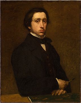
| A Cool Hip Degas Piece (Not in pastel unfortunately) |
| First Things First: I'm a realist. |
![]() |
| Two Dancers (The last known Degas piece, done in pastel) |
I decided to make a complete 180 from what I was doing before. Shadows, highlights, shape (all the fundamental elements of art) were annoying me. So I decided to do one of the things that initially inspired me to do pastel: sunsets. The colors blend together beautifully, and it would use as much or as little of my pallet as I want.
As with my still lives, I took two weeks to work on this. My first week, again, was tutorial work.
I followed this lovely tutorial to do my very first pastel sunset. I followed it as best as I could, but I decided to omit the tree in the front because I would mess it up. Speaking of mess ups, my clouds. I had already finished the piece when I decided to create these sins. I figured, hey, the reflection looks pretty nice. Why not ~spice it up~ a little. Then I messed up. These clouds are far less than ideal. This is a recurring theme. Here's the new shadows, my dudes.
I tried to do a night sky next (following this here tutorial). Not really a sunset exactly, but we're going to ignore that. This turned out pretty good. Not too much to say about this one. Just a lot of finger blending and the such.
Now here the clouds return. I have mixed feelings about these clouds. Some of them were okay, no thanks to the two video tutorials that I watched and followed. I'm not even going to link them, because they were awful. They were just like
Here's How To Draw A Cloud! (TM)
Step 1: Draw a Cloud
Thanks for watching! Make sure to like, comment, and subscribe!!!!!!
I'm so done. I tried a few different ways to draw it, and I can't decide which I like best. Be sure to comment what you like best ;)
Now begins my original work. I pulled up a photo of a sunset and basically winged it. I'd say it turned out pretty okay. As I mentioned (I think) one of the primary reasons I chose sunsets is because they are very forgiving. If I make a color mistake, I can just pastel over it and it still looks okay.
At this point I decided, "Hey. This isn't too bad. Why don't I ~challenge myself~. And so I did. I picked a photo of a sunset with no pinks. All it had was blues, yellows, and a few oranges. It took me forever to do on that lovely snow day, but I'd say it turned out a-okay. Wow a rhyme! Hit me up Nina.
And that's all I have for you, in regards to art, as of right now. I might do another piece or two over the course of this week, but I'll only update this post if they are VERY GOOD.
The only development aside from physical art that I made over these weeks is fixative. Fixative is a spray that you spray onto pastel pieces so that the dust doesn't come off onto your fingers. It essentially fixes the pastel onto the paper. Unfortunately, it is expensive (for me at least) at $10-15 per bottle. So I decided to peruse the interwebs for new knowledge about how to cheap my way through this. As it turns out, I could very easilly use my $3 thing of hairspray in place of fixative, and it does the same job, which is Pretty Dang Cool.
All right that's all I've got. See you all next cycle <3 (oh my lord that is the cheesiest thing I have ever done please kindly smite me)
I ended last week on a low note, attempting my first original piece. I attempted to draw an apple from a model (note: this apple was not model. it was tiny and misshapen which was the root (😉) of my problems.)
The apple itself doesn't look all that bad. The main issue here is the lighting. I tried to do the shadow literally three times. And I still never got it right. I suppose I have lighting prosopagnosia. This shadow struggle is a recurring theme, don't worry. You could write an entire five paragraph literary analysis essay based on this post about how bad I am at drawing lights. This would be paragraph one.
But before we get to that, lets look at how I tried to improve myself. Day 6 last cycle I decided to try to correct one of my many faults. I figured, it can't be a bad idea to do the stereotypical "draw a light source and a sphere and shade it in" activity.
And here we have it. My highlights weren't all that bad, in my opinion. The shadow, however... is not ideal. That is not what a sphere shadow looks like, Amanda. Please get yourself together.
And so I tried. And failed. And died.
My first attempt at real art wasn't all that bad. I tried to recreate my apple art, but this time not completely terrible.
Realistically, this is the best piece I've made. The lighting is pretty solid (though the shadow is a bit misshapen), and the coloring looks pretty realistic, even if it slightly resembles a mango with a badly drawn stem.
My next adventure was worse. I have process photos for this one, don't worry. You can view my mistakes in chronological order.
Drawing a strawberry was a mistake. This would be paragraph two in your analysis of Amanda's failures. The main issue was the seeds. Strawberry seeds, since they are on the outside of the fruit, and sunken into the flesh a bit, causing the lighting to be odd in these places. I unfortunately did not realize that before I began, leading to this beautiful art that I can conclusively say is my worst piece as of now.
Now lets make a full circle ending in our final paragraph. The final gaffe is an orange, as I referenced in the beginning of this post. Oranges are difficult to draw because they are all one color. Things like apples (and even strawberries) have hints of other colors that make having depth very easy. The orange, however, is just orange. As you can see from the photo on the bottom middle, I had to erase the entire shadow. Like, the whole shadow. This orange took about two hours to create. Let me put that in perspective. All the other works I have done have taken 45-60 minutes. But this horrible creation took me two hours.
Then again, not all bad came from this week. I got an interview with Nancy Poucher from Poucher Pastels, who creates pastel art and sells it.
The apple itself doesn't look all that bad. The main issue here is the lighting. I tried to do the shadow literally three times. And I still never got it right. I suppose I have lighting prosopagnosia. This shadow struggle is a recurring theme, don't worry. You could write an entire five paragraph literary analysis essay based on this post about how bad I am at drawing lights. This would be paragraph one.
But before we get to that, lets look at how I tried to improve myself. Day 6 last cycle I decided to try to correct one of my many faults. I figured, it can't be a bad idea to do the stereotypical "draw a light source and a sphere and shade it in" activity.
And here we have it. My highlights weren't all that bad, in my opinion. The shadow, however... is not ideal. That is not what a sphere shadow looks like, Amanda. Please get yourself together.
And so I tried. And failed. And died.
My first attempt at real art wasn't all that bad. I tried to recreate my apple art, but this time not completely terrible.
Realistically, this is the best piece I've made. The lighting is pretty solid (though the shadow is a bit misshapen), and the coloring looks pretty realistic, even if it slightly resembles a mango with a badly drawn stem.
My next adventure was worse. I have process photos for this one, don't worry. You can view my mistakes in chronological order.
Drawing a strawberry was a mistake. This would be paragraph two in your analysis of Amanda's failures. The main issue was the seeds. Strawberry seeds, since they are on the outside of the fruit, and sunken into the flesh a bit, causing the lighting to be odd in these places. I unfortunately did not realize that before I began, leading to this beautiful art that I can conclusively say is my worst piece as of now.
Now lets make a full circle ending in our final paragraph. The final gaffe is an orange, as I referenced in the beginning of this post. Oranges are difficult to draw because they are all one color. Things like apples (and even strawberries) have hints of other colors that make having depth very easy. The orange, however, is just orange. As you can see from the photo on the bottom middle, I had to erase the entire shadow. Like, the whole shadow. This orange took about two hours to create. Let me put that in perspective. All the other works I have done have taken 45-60 minutes. But this horrible creation took me two hours.
Then again, not all bad came from this week. I got an interview with Nancy Poucher from Poucher Pastels, who creates pastel art and sells it.
I'd like to begin this post with something I read online a few minutes ago. Essentially, blowing pastel dust is a terrible idea because it can make its way into your lungs and give you cancer. Guess what I've been doing to every pastel piece I made this long weekend! It's a good thing I don't have asthma.
Aside from the fact that my lungs might collapse, this weekend was a very good weekend for pastels. I had the time to follow online tutorials and make two (2) finished pieces, as well as a sheet of shading techniques.
I began the day on Friday with some shading techniques. I know, what a n e r d, doing homework on first day of a four day weekend. I'm actually enjoying this though, so it doesn't really feel all that much like work. Aww look! The point of the project! Right there! Anyway, I followed this pastel tutorial and this pastel tutorial to get me started on pastels.
(I'm sorry for this terrible photo. It seems I'm better at pastel than I am at photography.) The panel on the left follows the techniques from the first video. I first drew four rectangles, with red on one end, orange in the middle, and yellow on the other end. My goal was to blend them together as seamlessly as possible.
First I used the most basic method, just using my finger. That created a pretty solid, if a little smudgey, blend that was more mixing the colors than creating a gradient.
Then I tried using a blending stump. A blending stump, for those uninitiated, looks a little something like this. It created the best blend, in my opinion. It made a seamless transition from red to yellow. The only issue with this is it is very time consuming, and is kind of hard to use.
I then tried a q-tip. This went terribly. 0/10 would not recommend. The colors smudged everywhere, and the q-tip took a lot of pigment off of the paper.
The final technique recommended was a kneaded eraser. Again, for those who aren't all that artsy, a kneaded eraser is essentially a squishy grey eraser. It can be kneaded into many shapes. This looked okay blended, but I wouldn't waste my eraser on it. My finger is definitely the preferred technique, but the blending stump is nice for small areas.
I'm not going to bore you with the rest of the techniques from the other video. You can take a quick look.
Here comes the exciting part. I followed this tutorial to make a pastel pear.
I should have probably taken a picture between the first and second steps, but whatever. What's done is done. It turned out far better than I expected, and far better than anything I have made before. I had never quite noticed how red a pear is, but looking at it, it looks odd without it. I learned a lot, technique-wise, from creating this piece. First of all, finger blending is excelent. Using a blending stump just isn't practical for what I've been doing. Also, I learned a technique called layering. In the past, I had just drawn on all the colors, blended them together, then been done with this. But this used multiple layers of pastel, beginning with shadows and outlines, then base colors, then highlights. I had never worked with that before. Maybe that's why my past pieces were so bad...
On Sunday I picked up the pastels again and followed this much harder tutorial teaching how to draw a watermelon.
This piece doesn't look to complicated at first glance. Just grab a few green pastels, a red, and a black, and you're ready to go right? Wrong.
And that was just what I thought I needed. I also had to pull out a few light shades of gray, as well as some pastel yellows. This piece required a lot of layering. I had to first put in a layer of dark pink, then layer over it various shades of pink and even white at some point. Then I had to layer more dark pink atop that in order to bring depth to the picture.
I did more work on Wednesday to try and shade an apple without a tutorial. It didn't turn out well, mostly because the lighting was odd. I'm working on redoing it. But, that's a post for another day.
Also, I contacted the person running this blog for an interview. She hasn't gotten back to me yet, but I'm hopeful!
Hopefully I'll get to work on it more this week! My goal is to get 3-4 pieces done a week, most of which I'll be able to do on weekends like this, or on Thursday/Friday evenings.
Aside from the fact that my lungs might collapse, this weekend was a very good weekend for pastels. I had the time to follow online tutorials and make two (2) finished pieces, as well as a sheet of shading techniques.
I began the day on Friday with some shading techniques. I know, what a n e r d, doing homework on first day of a four day weekend. I'm actually enjoying this though, so it doesn't really feel all that much like work. Aww look! The point of the project! Right there! Anyway, I followed this pastel tutorial and this pastel tutorial to get me started on pastels.
(I'm sorry for this terrible photo. It seems I'm better at pastel than I am at photography.) The panel on the left follows the techniques from the first video. I first drew four rectangles, with red on one end, orange in the middle, and yellow on the other end. My goal was to blend them together as seamlessly as possible.
First I used the most basic method, just using my finger. That created a pretty solid, if a little smudgey, blend that was more mixing the colors than creating a gradient.
Then I tried using a blending stump. A blending stump, for those uninitiated, looks a little something like this. It created the best blend, in my opinion. It made a seamless transition from red to yellow. The only issue with this is it is very time consuming, and is kind of hard to use.
I then tried a q-tip. This went terribly. 0/10 would not recommend. The colors smudged everywhere, and the q-tip took a lot of pigment off of the paper.
The final technique recommended was a kneaded eraser. Again, for those who aren't all that artsy, a kneaded eraser is essentially a squishy grey eraser. It can be kneaded into many shapes. This looked okay blended, but I wouldn't waste my eraser on it. My finger is definitely the preferred technique, but the blending stump is nice for small areas.
I'm not going to bore you with the rest of the techniques from the other video. You can take a quick look.
Here comes the exciting part. I followed this tutorial to make a pastel pear.
I should have probably taken a picture between the first and second steps, but whatever. What's done is done. It turned out far better than I expected, and far better than anything I have made before. I had never quite noticed how red a pear is, but looking at it, it looks odd without it. I learned a lot, technique-wise, from creating this piece. First of all, finger blending is excelent. Using a blending stump just isn't practical for what I've been doing. Also, I learned a technique called layering. In the past, I had just drawn on all the colors, blended them together, then been done with this. But this used multiple layers of pastel, beginning with shadows and outlines, then base colors, then highlights. I had never worked with that before. Maybe that's why my past pieces were so bad...
On Sunday I picked up the pastels again and followed this much harder tutorial teaching how to draw a watermelon.
This piece doesn't look to complicated at first glance. Just grab a few green pastels, a red, and a black, and you're ready to go right? Wrong.
And that was just what I thought I needed. I also had to pull out a few light shades of gray, as well as some pastel yellows. This piece required a lot of layering. I had to first put in a layer of dark pink, then layer over it various shades of pink and even white at some point. Then I had to layer more dark pink atop that in order to bring depth to the picture.
I did more work on Wednesday to try and shade an apple without a tutorial. It didn't turn out well, mostly because the lighting was odd. I'm working on redoing it. But, that's a post for another day.
Also, I contacted the person running this blog for an interview. She hasn't gotten back to me yet, but I'm hopeful!
Hopefully I'll get to work on it more this week! My goal is to get 3-4 pieces done a week, most of which I'll be able to do on weekends like this, or on Thursday/Friday evenings.